When building a premium lighting brand identity, the challenge is to visualize illumination without relying on cliché imagery like lightbulbs. For our client, STELORA, we wanted to create a symbol that felt structural, architectural, and high-end, while remaining warm and inviting for modern living spaces.
The Client Vision
STELORA is a luxury decor brand dedicated to crafting timeless illumination. They needed a visual language that reflected their commitment to quality, aesthetic simplicity, and functional elegance. Our goal was to design a logo that stands out in the competitive home decor market.
The Design Challenge
Creating a premium lighting brand identity requires a balance between boldness and subtlety. The logo needed to be versatile enough to work on packaging, digital platforms, and even etched onto physical metal switches. We avoided standard icons and instead focused on the typography itself to convey the message of “light.”
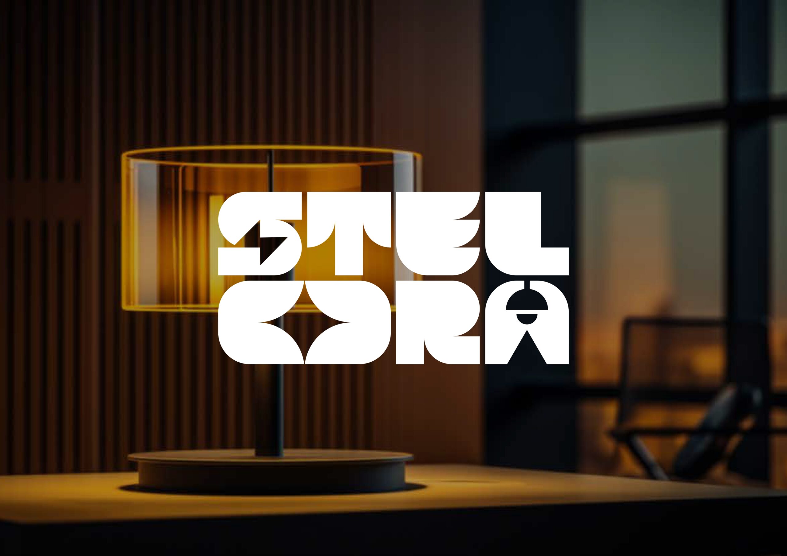
Our Solution: Geometric Elegance
Our approach centered on custom geometric typography. We deconstructed the letters to mirror the shapes of light fixtures and beams.
- Symbolism: The “O” and “A” utilize negative space and archways to mimic the silhouette of pendant lamps and light spread.
- Typography: The bold, wide-set lettering establishes authority. This style is often seen in Minimalist Design movements, where “less is more.”
- Color Palette: We utilized a vibrant Burnt Orange (representing warmth and tungsten light) against a Deep Charcoal background to create high contrast.
Why This Identity Works
A successful premium lighting brand identity must be memorable. The integration of “rays” and “lamp silhouettes” directly into the text links the name to the product function instantly. It captures the essence of “lighting your moments beautifully” through a balance of heavy industrial shapes and airy cuts.
